
New Yorker Food Magazines
Illustration | Branding
Programs: Procreate and Adobe Photoshop
Institution: Tyler School of Art and Architecture, Temple University
Art Direction: Caleb Heisey, Spring 2021
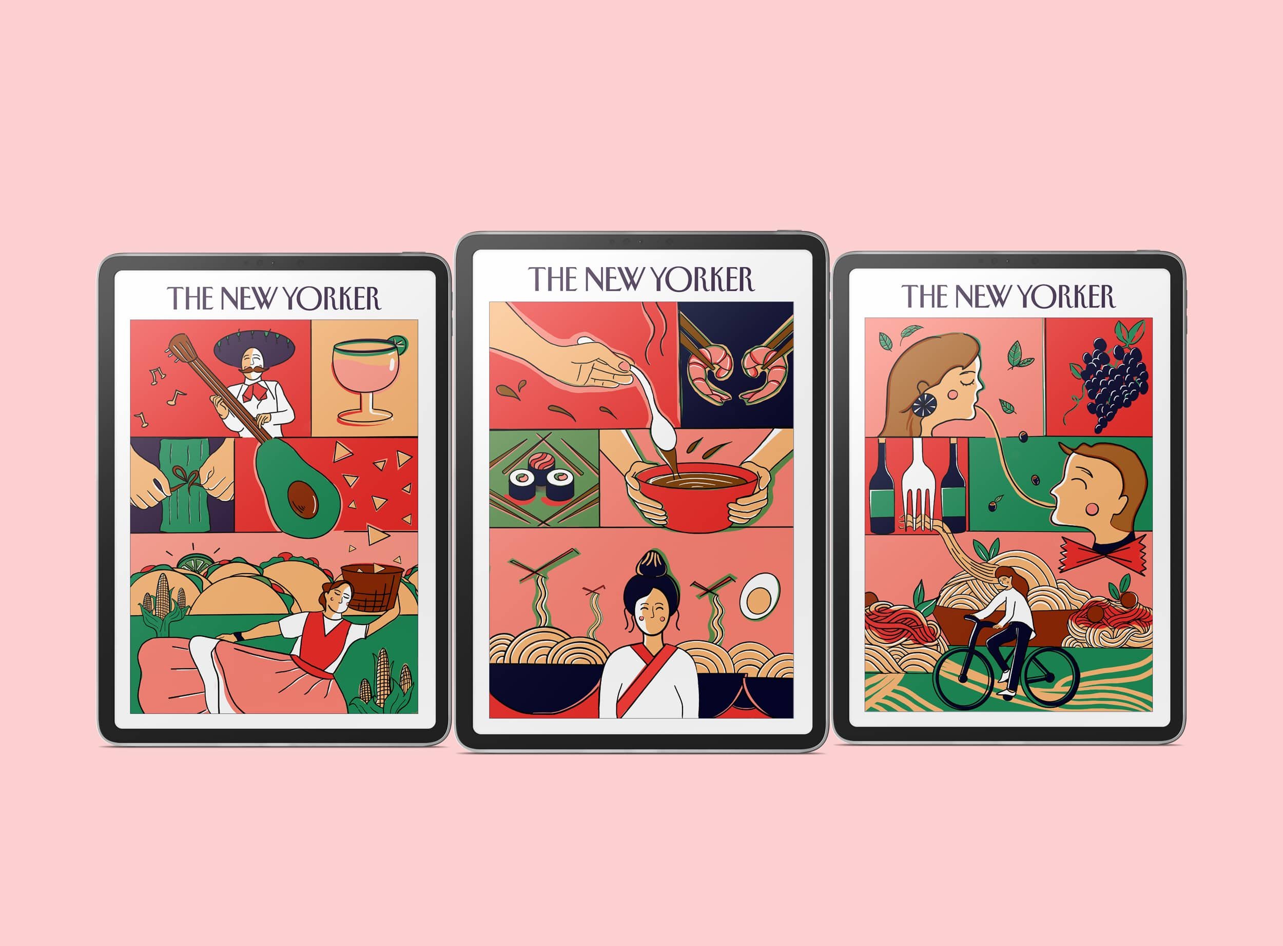
The goal of this project was to create a series of New Yorker magazine covers for three different countries that showcases their respective food cultures. I chose to capture the essence of Oaxaca, Mexico; Kyoto, Japan; and Florence, Italy. For the overall style, I incorporated a grid layout and a limited color palette with sharp contrast. My main goal was to showcase how foods have blended into the lifestyle of these cultures by creating food landscapes and finding unique visual connections.

Brainstorming
For each location, I came up with a list of foods and cultural aspects after researching about the three locations to discover what each place was known for. After narrowing the list down, my challenge was how I could combine food with these visuals: i.e., Thing + An Unrelated Thing!

Thing + Unrelated thing!
For Florence, Italy, I focused on the unique variety of pasta shapes and how they could form interesting visuals. I started by listing any play-on words or phrases that came to mind and thought about how that could combine with the foods to create beautiful scenic landscapes.
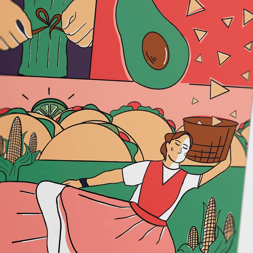
For Oaxaca, Mexico, I focused on the lively festivals and instruments from the Guelaguetza event (a festival of music, dance, costumes, food, and of the mutual interdependence of people within a community).
For Kyoto, Japan, I focused on foods such as miso soup, shrimp, sushi, and noodles.
Colors
When determining my color palette, I knew I wanted to choose a high-contrast and minimal color scheme that would fit for each food culture. Green was vital because I knew I was incorporating a nature landscape in each grid. Yellow, pink, red, and brown were my warmer colors to balance out the darker blue. In Photoshop, I converted my colors to Grayscale in order to determine the contrast of my selected palette. Seen below is the sharp range of black and white values that came from the chosen colors.

Sketches
In each grid, I zoomed in and out of different blocks to create an interesting visual as a whole. In addition, I wanted the blocks to interact with each other and break the confines of the grid.


Final Applications


Takeaways
This project allowed me to design a digital magazine cover series while celebrating the food culture of three cuisine capitals of the world. It was a challenge to not incorporate literal illustrations of monuments, attractions, landmarks, etc. Creating these covers taught me to think deeper than the surface, research, and create thoughtful visual connections between the foods and their lifestyles. In addition, playing with scale, creative cropping, and using a minimal color palette created an eye-catching composition and consistent style across the series.
